

Pantone’s Color of the Year is a highly anticipated announcement for design aficionados and consumers alike, and the color institute’s heralded shade for 2022 is Very Peri—a blue hue with warm red undertones that “encourages personal inventiveness and creativity”. As expected, there are many factors at play when making this selection. Here, Pantone Color Institute Executive Director Leatrice Eiseman shares her insights on this celebrated new shade, and suggests how to embrace it in one’s home.
Purposefully dynamic
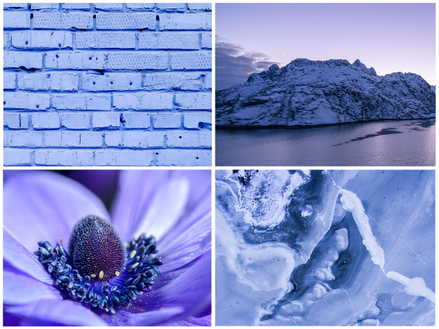
According to Eiseman, Very Peri’s violet hue is especially unusual because while it embodies variations of blue, it’s an unexpectedly lively color. “When you add that red violet undertone, you’re adding energy to the color, a certain dynamism,” she explains. “When you ask people what temperature blue is, they say cool. But when you add that other element of red violet, now you’re adding some excitement to the color, you’re energizing it.”
Development and inspiration
Determining Pantone’s Color of the Year is an alchemy of science and culture. On the technical side, creating Very Peri took more time than usual. “There’s a lot of give and take that goes on with the scientists, and when you say ‘it needs a tad more violet’ you have to go further than a tad,” Eiseman explains when asked about the process. “It was a back and forth, then we tested it in the digital realm, paper, and print.”
For initial inspiration, Pantone looks to trends in a range of fields, from the art world, to museums, to films, to fashion and beauty. “What else is out there, that we see happening in the future, will validate our choice,” she says.
The Desire For Newness
Innovation and freshness are important in any new year, but perhaps even more so in 2022. Striving for newness was precisely the goal with Very Peri. “We deliberately invented a new color, the idea of newness as we looked towards the future,” Eiseman says. “Our lives have been upended in the last few years and we’re looking for new ways of living.” She notes that new techniques, technologies, and digitization have impacted color and increased its vibrancy, especially as gaming and animation increase in popularity.
Consider Fabric and Texture
Athena Wang, New Zealand Sotheby’s International Realty
Eiseman highlights a French term, changeant, that applies to Very Peri, which is the color’s changeable quality. She points to luxury fabrics with metallic shimmer, or silk or taffeta, that embody this transformational ability, and how the color of the year would lend itself well to those textures. “The color itself has the undertones melting into the blue,” she says. “It’s like an optical illusion that’s happening. It can be very striking and intriguing.”
Start Small At Home
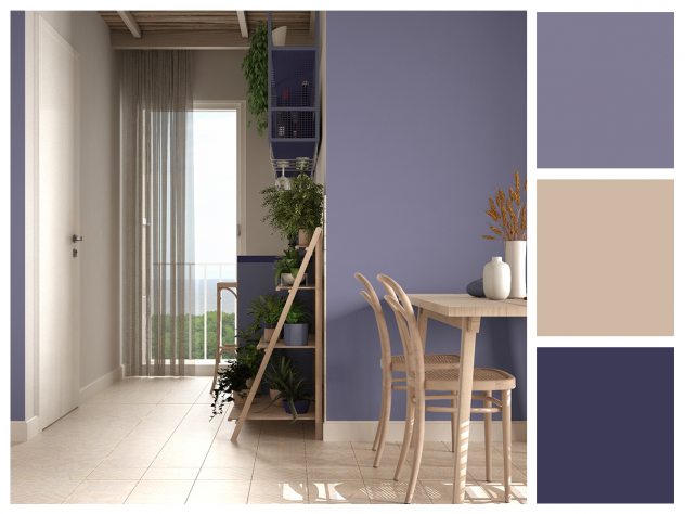
At first glance, Very Peri may be a daunting shade to incorporate at home, but Eiseman has advice for those who are hesitant. “For anyone who is more timid, use it in small touches,” she advises. “Experimenting in small steps and using paint in particular is so easy to change out.”
Eiseman recommends staying away from commitments like tile or furniture that’s not easy to reupholster, but the shade can be used to refresh existing furniture. “Now you’re adding some whimsicality, some humor,” she says.
It’s About Context
With all home design choices, the impact comes down to context. Eiseman encourages asking the following questions: “Where is it, what’s the attitude, what do you want to get across? [What’s] the mood that you want to create?”
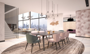
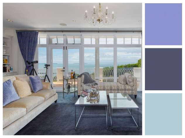
For example, Very Peri might seem playful as a painted accent wall in a living room, but in a bedroom, it’s more serene—the latter is a choice Eiseman has personally embraced. “It’s a wonderful bedroom color, associated with calming blue, and yet some fire underneath the color.”
As Eiseman has shared, Pantone’s Very Peri has the power to evoke energy, yet simultaneously provides a sense of calmness—managing to perfectly capture the desires of our time. With enough intrigue and optimism to carry us through 2022, Very Peri’s versatility means this hue is likely to feel at home in any house.
Look ahead for more home décor trends, and get inspired by Spring 2022 Pantone Colors of the Year.